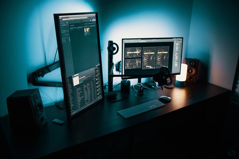
Most digital professionals realize that getting a user’s attention is a primary factor in achieving your online goals.
We’ve all seen the popups, huge buttons, and animation that works to draw a user somewhere on a webpage in hopes of a racking up a conversion or lead.
But how do we know what is good and what is just too much?
It turns out that Google doesn’t really like when websites throw attention grabbing visuals at a user that fight for visual space or make it difficult for the user to engage in the core page material. This problem doesn’t just start and end with webpages and Google, though. Taking strategic steps to grab a viewers attention is a large part of any design, both physical and digital.
This means that there has to be a safer, more optimal path to increasing conversion while bettering design overall, right? Well, yes.
Good design uses appropriate CONTRAST.
Establishing a hierarchy of importance by using contrast in color, size, shape, and type is critical as it will give your design or website a clear and concise message to your audience. To understand how to properly use contrast in your design, we first need to know what contrast is.
Contrast is defined as “the degree of difference between things having similar or comparable natures.” A simple way of understanding this is it is the difference between black and white, big or small, thick or thin. These examples are all on the opposite side of the spectrum, making sure nothing is blending together.
Contrast will make your design exciting and aesthetically pleasing. Also contrast will create a focal point for your eye to naturally draw in to. This helps organize the information and guide the reader to get a better understanding of what you deem as important to them.
Let’s take a look at some of the different ways we can use contrast to help our design.
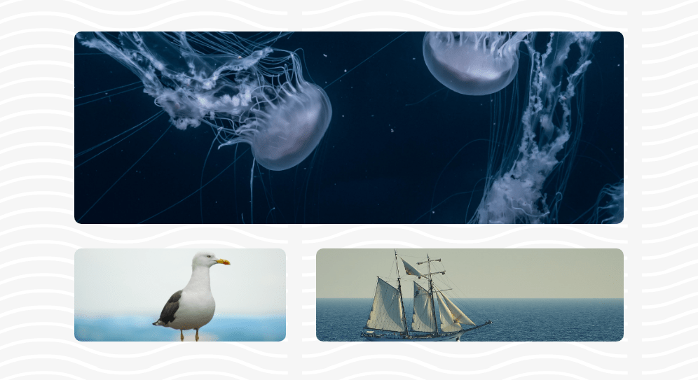
Contrast of Color
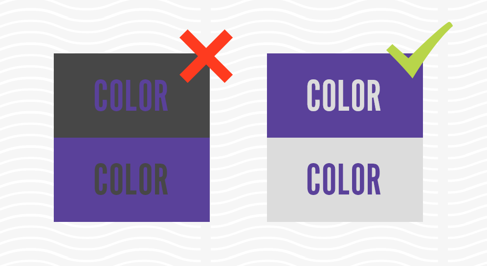
Using colors that are too close to each other can make the design feel bland or unaccessible. An easy way to make sure you have a separation of colors is to make sure the luminance values are different on the colors you choose. A simple example of this is black and white. This will help your objects you want to highlight stand out from the rest of the design.
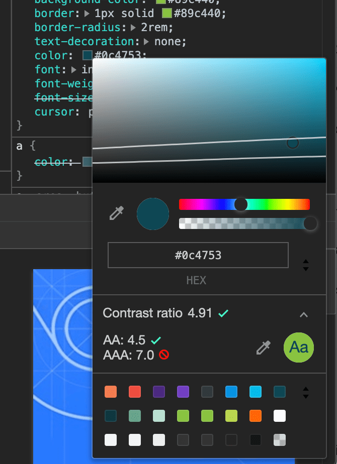
When it comes to digital design, several of the most popular web browsers provide designers tools to evaluate whether a design is using a level of contrast that will be ADA Compliant. If you inspect any element via the browser and select the color in question, you should be able to see the contrast guide and make more educated decisions on the level of the color contrast.
When it comes to digital design, several of the most popular web browsers provide designers tools to evaluate whether a design is using a level of contrast that will be ADA Compliant. If you inspect any element via the browser and select the color in question, you should be able to see the contrast guide and make more educated decisions on the level of the color contrast.
Google also provides some information on how color contrast can affect accessibility.
Contrast of Size
Whether it is text or images, sizing can create a separation to show what is most important to you and guide the user through the design. Focus the user’s attention on the larger objects while supplementing it with the less important information in smaller blocks.
Contrast of Type
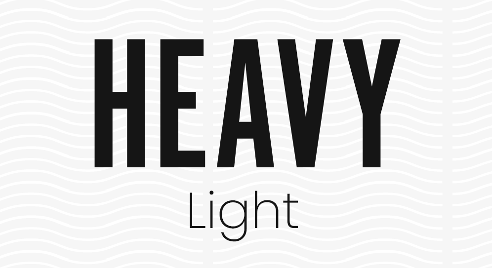
You can use different typefaces to help give contrast to your design. Complemented by different sizes and weights, you can create a hierarchy that stands out to the audience.
Contrast of Shape
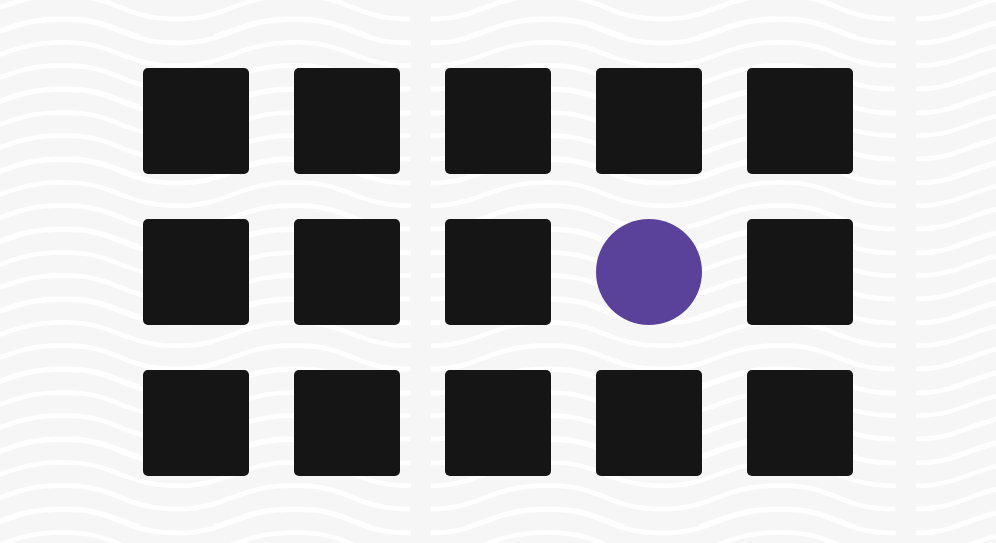
Using unique shapes in your design or web page can help catch the eye of your viewer. Using a shape or image that breaks up the grid-like feel of your content can grab the user’s attention and focus on that particular object.
Contrast of Position
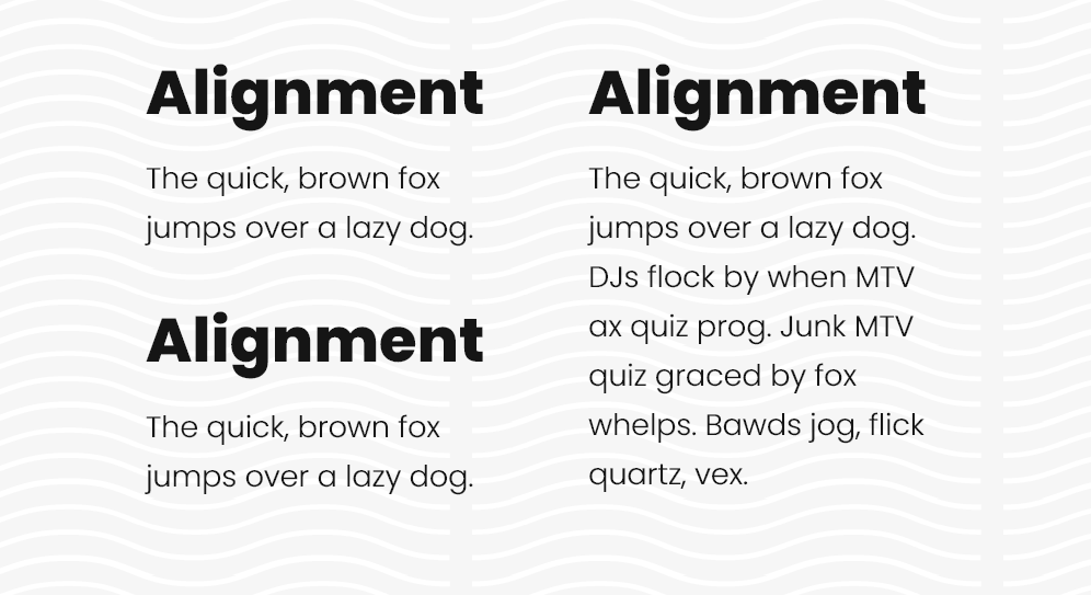
Aligning and spacing around content blocks will help differentiate and group related information and create a design that is easy to navigate. Use whitespace to your advantage for this. Whitespace can help focus on the most important feature of the design.
There is a lot more that goes into graphic design and improving interaction, but using these contrast tips can help you level-up your work by creating intentional flow and separation to your design.